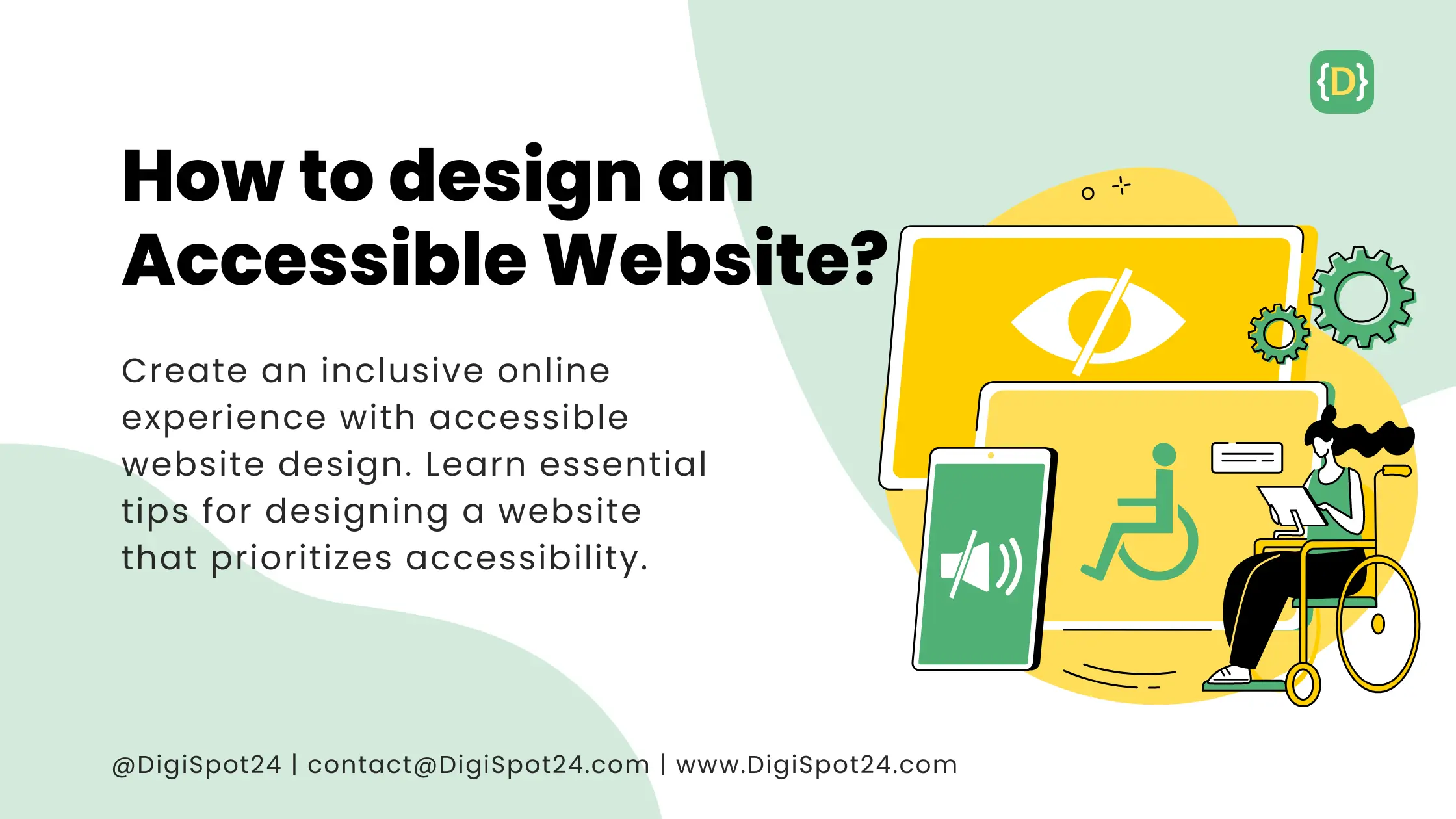
In today’s digital landscape, developing a website that is accessible to all users is not just a best practice; it’s a necessity. An accessible website ensures that individuals with disabilities can effectively perceive, understand, navigate, and interact with online content. Whether you’re designing a website for a business, organization, or personal use, integrating accessibility features is paramount to reaching a wider audience and offering an inclusive online experience. In this guide, we’ll delve into the essential elements of designing an accessible website while emphasizing the importance of keyword inclusion for optimization.
- Comprehend Accessibility Guidelines: Familiarize yourself with accessibility standards such as the Web Content Accessibility Guidelines (WCAG). These guidelines serve as a blueprint for creating accessible web content and are widely acknowledged as the gold standard for web accessibility.
- Select an Accessible Platform: Opt for a website building platform or content management system (CMS) that prioritizes accessibility. Platforms like WordPress, Wix, and Squarespace offer accessibility features and templates that facilitate the design process.
- Prioritize Keyboard Navigation: Ensure that all website functionality and content can be accessed and operated solely using a keyboard. This is crucial for users who may not be able to use a mouse or other pointing device.
- Leverage Semantic HTML: Structure your website’s HTML markup using semantic elements (e.g.,
<header>,<nav>,<main>,<footer>) to provide meaningful information to assistive technologies like screen readers. - Incorporate Alternative Text for Images: Include descriptive alt text for all images on your website to ensure that users with visual impairments can comprehend the content of the images.
- Offer Captions and Transcripts for Multimedia: Videos should feature captions or transcripts to make the content accessible to users who are deaf or hard of hearing. Additionally, audio content should have transcripts for users who are unable to listen to audio.
- Ensure Adequate Color Contrast: Employ sufficient color contrast between text and background elements to enhance readability for users with low vision or color blindness. WCAG provides guidelines for minimum color contrast ratios.
- Implement Descriptive Link Text: Instead of using generic phrases like “click here” or “read more,” utilize descriptive link text that offers context about the destination of the link. This aids users who navigate websites using screen readers.
- Conduct Accessibility Testing: Regularly test your website for accessibility using tools such as WAVE Web Accessibility Evaluation Tool or the accessibility features integrated into web browsers. User testing with individuals with disabilities can also yield valuable insights.
- Stay Informed and Updated: Accessibility standards and best practices evolve over time, so it’s imperative to stay abreast of the latest developments in web accessibility and make updates to your website accordingly.

By following these guidelines and integrating accessibility features into your website design process, you can develop a more inclusive online experience for all users. Prioritizing accessibility in your design not only benefits individuals with disabilities but also improves usability and the overall user experience for everyone on your accessible website.
Read Also
Website design: Legal requirements explained?
See Our Portfolio


